
“ I learnt the craft of print before Macs were even dreamt of - when headlines were kerned with a knife not a key stroke, and photography was on film - so you can expect to see meticulous typography and eye-catching imagery”.

One in a series of ads that allowed the personal interests and passions of real customers to determine the style of ‘trophy’ they would present to the bank that helped them get a home loan. This family loved renovating.

Another in the series - this for a family who are sports mad!

More of the Home loans series - demonstrating the diversity of the bank’s customer base. This one for a customer who loved to decorate cakes!

This time a male focussed version of the Home loans testimonials - from a plumber!

The final in the Home Loan series where the family dreamed of leveraging their refinancing to include the kitchen of their dreams.

A poster from a while back when customers were expressing fears that their banks just weren’t listening to their needs - except BankSA of course!

A series of Press ads and posters that tapped into the public’s apathy around driving when they were “just a little bit over the limit”. I loved crafting this type to be an integral part of the visual.

Another in the series of Press ads and posters that tapped into the public’s apathy around driving when they were “just a little bit over the limit”. I loved crafting this type to be an integral part of the visual.
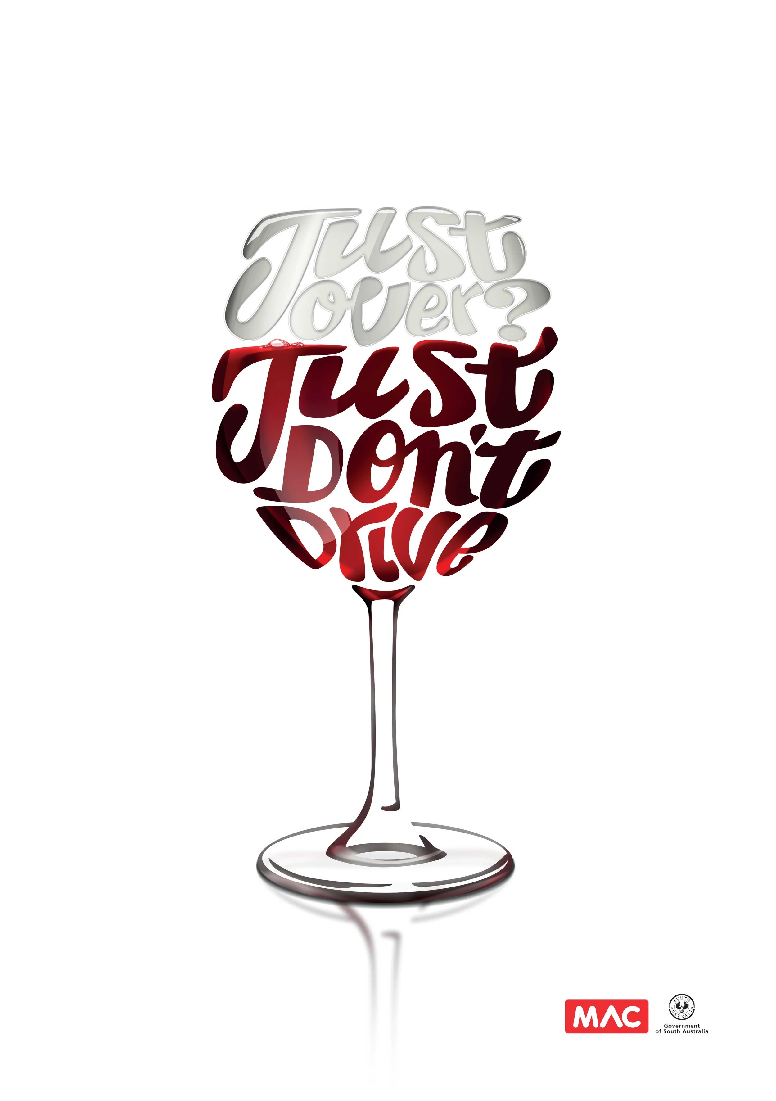
Another in the series of Press ads and posters that tapped into the public’s apathy around driving when they were “just a little bit over the limit”. I loved crafting this type to be an integral part of the visual.

A truly humbling experience, and a highlight of my career - meeting, interviewing and photographing a selection of farmers from all corners of Australia who subscribe to the old school philosophy of loyalty - supporting the people who support them. Photo by Paul Torcello.

Alec embodies spirit of the quintessential Australian farmer - rugged exterior, soft inside - dedicated to caring for his livestock and providing the best for his family. And he also believes in supporting the people who support him. Photo by Paul Torcello.

Michael Butterick lives by the changes in the weather - his crop totally dependant on careful planning and subject to fickle weather. The only constants are the love of his family, and the support and advice of suppliers like Elders. Photo by Paul Torcello.

Another example of passionate farming philosophies brought into reality by those prepared to take a risk, all the time knowing that they had the support of Elders. Photo by Paul Torcello.

Sometimes to reach a certain audience you need to speak their language. So who better to warn motorcycle riders about the importance of wearing the right riding gear than Aussie Moto-GP legend Mick Doohan?

A series of hypothetical scenarios demonstrated the critical nature of risking getting behind the wheel whilst under the influence of drugs. Photo by Daniel Noone.

A series of hypothetical scenarios demonstrated the critical nature of risking getting behind the wheel whilst under the influence of drugs. Photo by Daniel Noone.

A series of hypothetical scenarios demonstrated the critical nature of risking getting behind the wheel whilst under the influence of drugs. Photo by Daniel Noone.

A risky campaign for a brave client - we created a visually interactive campaign that called out drunk divers as “W-Anchors” (Wankers) - and gave their mates permission to shame them for their dangerous habits.

Country folk are generally fairly pragmatic and honest with each other. it’s what helps them to survive in such a harsh climate as ours. We tapped into this language in a “no punches pulled” approach to road safety, in this widely accepted and successful campaign.
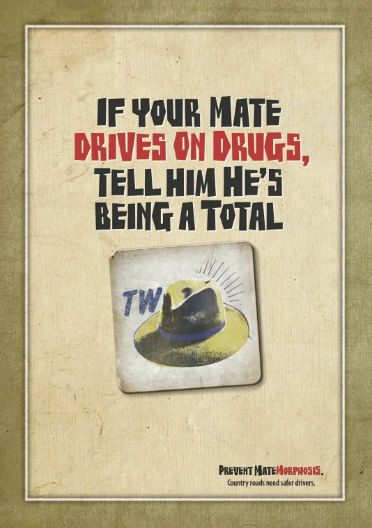
Another in the series using pictograms in the shape of Drink coasters. Actual coasters were printed and supplied to regional bars and clubs providing mates with the tools to flag when their mates were acting like total ‘twats’.

Another pictogram - brilliantly illustrated by Ben Sanders. This time it may take a little longer to work it out - but that’s why the campaign resonated so well with young men from regional areas. Rather than telling them what to do, we were speaking their language and allowing them to engage.

Sometimes the only way to encourage behaviour change is to call it how you see it. So when your mate is speeding on country roads - there’s nothing else for it - you have to tell him he’s being a “knob”!

Who would have thought that I’d ever be happy to see my work on the side of a humble ‘pie bag’? But I couldn’t be more proud! Following on from the ‘Matemorphosis’ campaign - ‘Bromance’ gave country drivers the permission to speak a little kinder to each other.

‘Become’ was a broad campaign featuring aspiring kids, that addressed the misconception that Public Schools offer a lesser opportunity to students in their quest to ‘become’. Some great portraits from photographer Liam West.

I love creating ads that demonstrate a point - in this case connecting point ‘A’ with point ‘B’ - demonstrated the simple act of buckling your seatbelt may prevent you spending your life in a hospital bed, or worse!

I worked with a team of talented people on this campaign in an effort to reach a very young and predominately dismissive audience who believed that driving “stoned” was safe. Nibbles (the pretzel) and his mates were dreamt up in response to stoners getting the “munchies”.

This image is one I’m very proud of. It demonstrates that even if you’re on a tight budget, with the right home loan, you can leave home earlier - even if you have to shift your belongings on public transport! This image also won a swag of awards for my photographer mate Richard Lyons.

The United Chemists logo already had a ‘smile’ in it. I just helped bring it to life though a series of vibrant, smiling portraits - courtesy of photographer Richard Lyons.

As the portraits were all captured in studio over the course of a day, I stripped in the backgrounds later to create a connection with the seasons.

While heading up the KWP Retail department I got to work very closely with Foodland, and helping them fulfil their brand promise “Great food lives here'“. As part of this, the entire catalogue was redesigned to adopt a cleaner, simpler template enabling faster turnarounds.

I’ve art directed a lot of different shots, from cars to places and faces - but this was one of the tastiest! All Australian product and great styling and photography by Brendan and Natalie Homan.


